BRAND IDENTITY · WEB DESIGN · DIGITAL CONTENT
ERITY
A cohesive brand identity and website crafted for ERITY,
a multidisciplinary consultancy specialising in governance, finance, technology, geology and business operations.
CLIENT
ERITY
ROLE
Lead Designer
DELIVERABLES
Brand, Web and Digital Design
Technical insight backed by evidence based methods
ERITY is a consulting and advisory organisation backed by advanced analytics and AI-enabled tools. The website and brand identity reflect its futuristic outlook and data-driven expertise.
01 CHALLENGE & APPROACH
ERITY brings together specialists from Geology, Mining, Law and Corporate Advisory. The challenge was to communicate this breadth of expertise clearly, without making the organisation’s services feel disconnected or like separate companies.
The brand needed to feel professional and credible while remaining sleek, contemporary and flexible across digital and marketing platforms.
Connecting multiple services under one identity
THE CHALLENGE
Working closely with company stakeholders, I developed a cohesive visual identity that could bring ERITY’s different services together under one recognisable brand.
A clear information hierarchy paired with concise messaging made ERITY’s multidisciplinary services accessible and engaging.
A flexible system across brand and digital
THE APPROACH
HUMAN LED
AI SUPPORTED
EVIDENCE DRIVEN
02 DESIGN SYSTEM
A Flexible Design System
Brand Colours
Electric teal acts as an accent and a symbol of future technology, while the primary deep blue grounds the identity in a corporate setting. Slate blue is used for body text, while copper is applied to secondary text and details, adding warmth to an otherwise cool palette.
#192850
RGB 25, 40, 80
CMYK 69, 50, 0, 69
#00F0F0
RGB 0, 240, 240
CMYK 100,0,0,6
#7AACBA
RGB 122, 172, 186
CMYK 34, 8, 0, 27
#9A6A4F
RGB 154, 106, 79
CMYK 0, 31, 49, 40
Motif
#000000
RGB 0, 0, 0
CMYK 0,0,0,100
#FFFFFF
RGB 255, 255, 255
CMYK 0,0,0,0
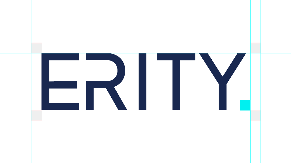
Minimal shapes are inspired by the rise of AI and a simultaneous shift away from intricate detail in fields such as architecture and fashion. The E and R allude to a battery or rocket ship, representing energy and innovation. The full stop, or pixel, is evocative of finality and ERITY’s definitive and authoritative identity.
Logo

The icons use minimal shapes and thin linework. They are used to categorise information across the website, capability statements and brochures. While most are kept simple, some include more intricate details to communicate complicated information clearly.
Iconography
















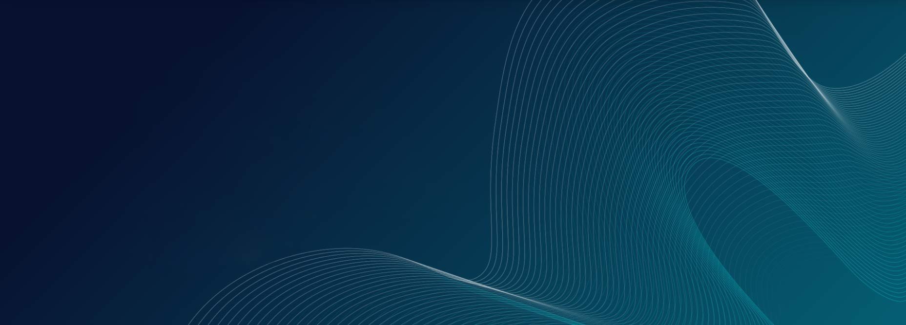
The motif is inspired by data visualisation, a graphical representation that simplifies complex information through graphics. The systematic lines contained within an organic, wave-like form represented ERITY’s analytical technology and human-led ethos.
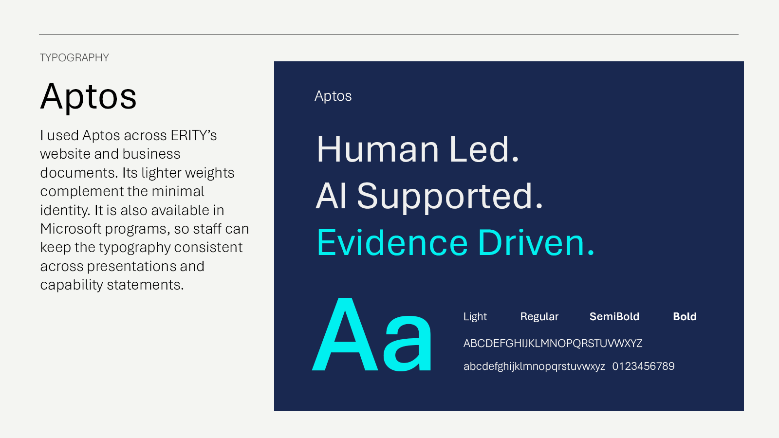
Typography
03 WEBSITE
Website
ERITY’s website is built with WordPress and Elementor. Erity.com reflects the design system through simple, intuitive navigation.
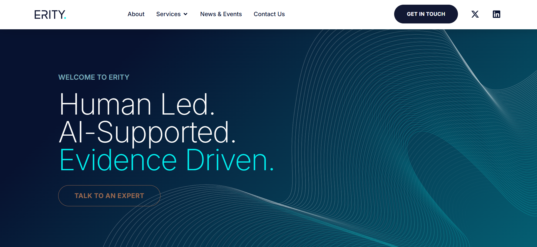
Website homepage
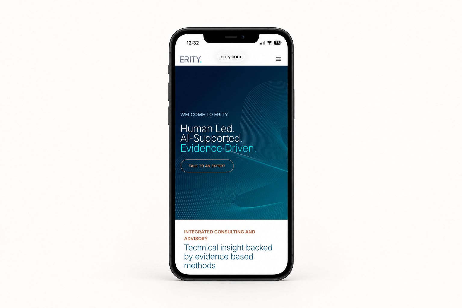
Mobile Website
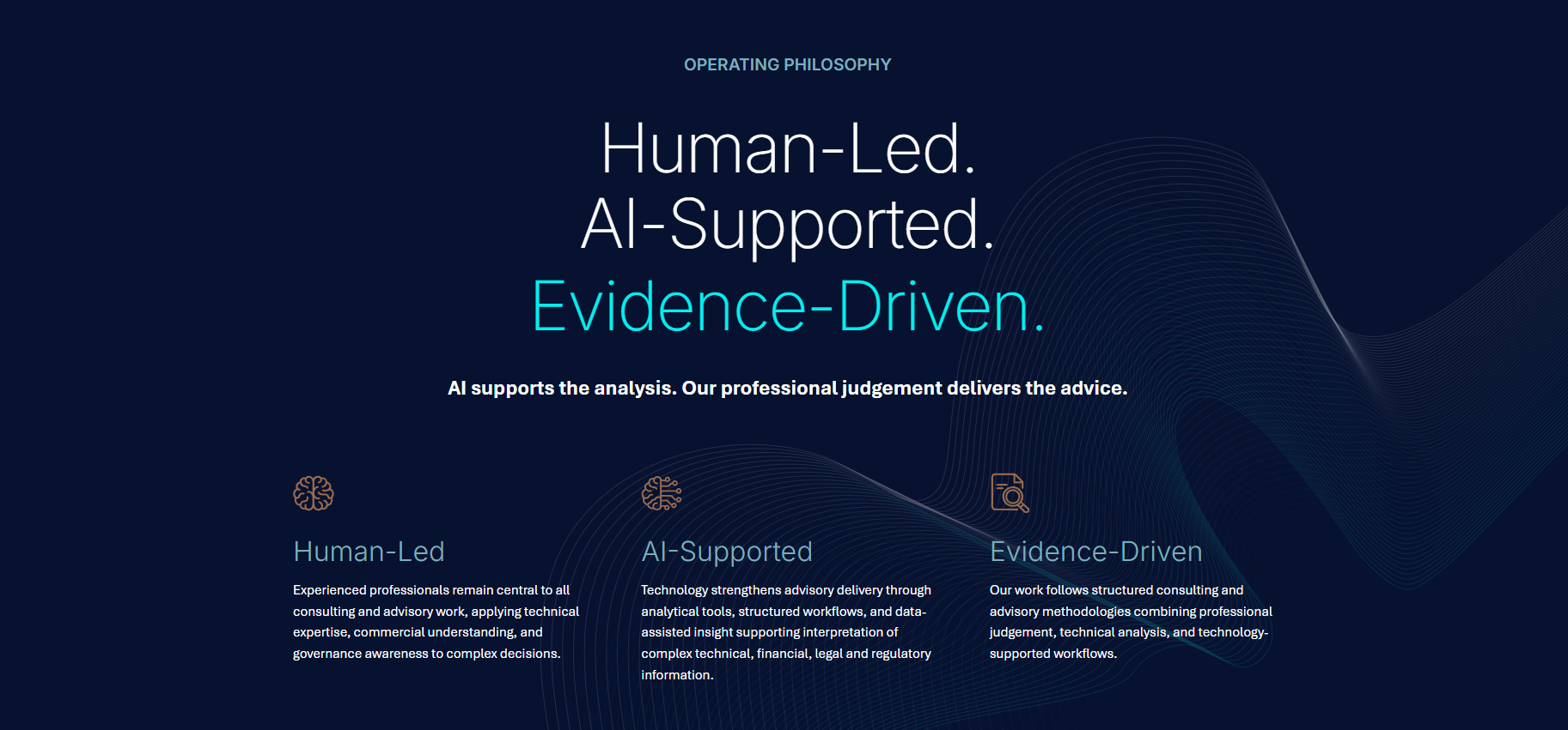
Operating philosophy graphic
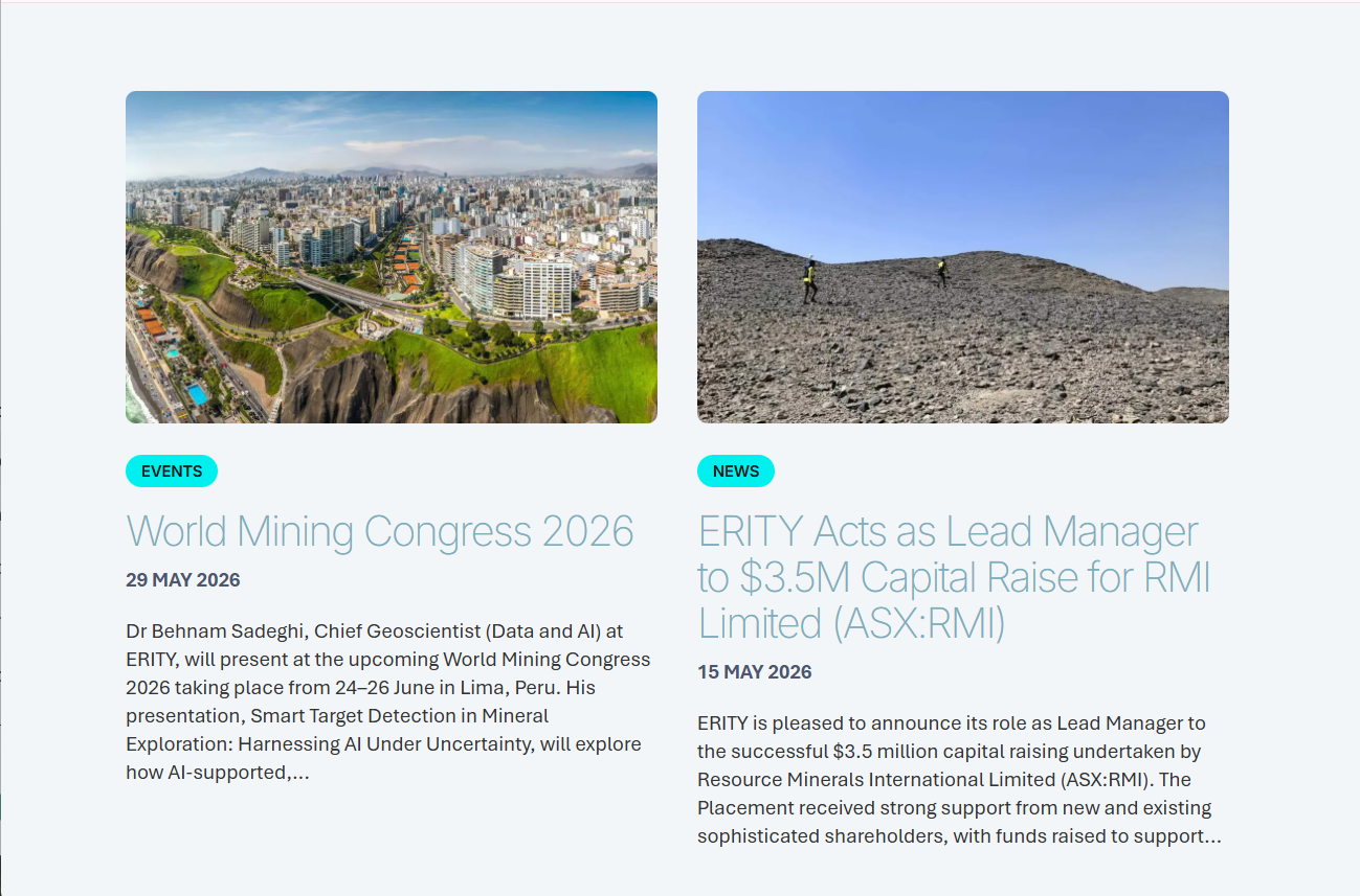
News & Events
04 DIGITAL COMMUNICATIONS
Digital Design
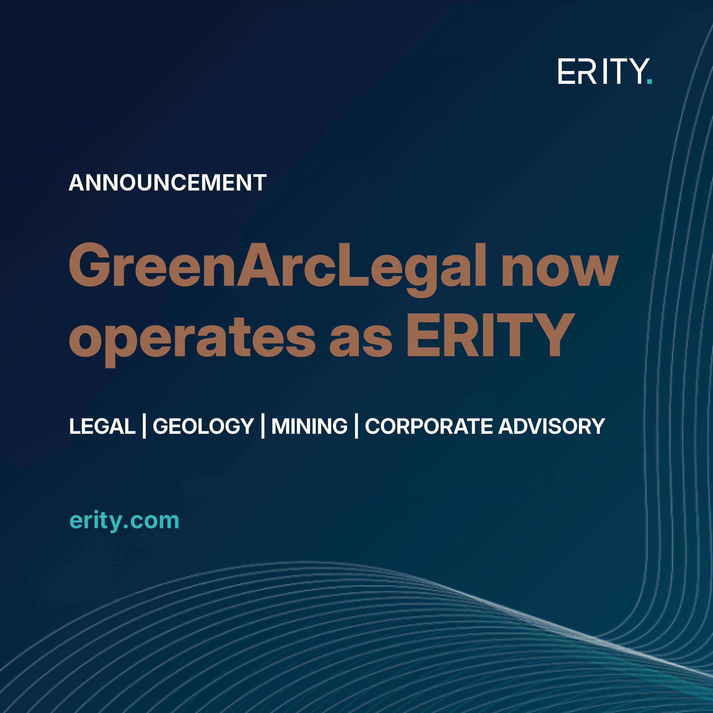
ERITY’s digital artwork remains consistent with the brand identity and is adapted for different platforms, including LinkedIn, Instagram and email. Simplicity and consistency ensure each design remains clear across different screen sizes.

05 PRINTING COLLATERAL
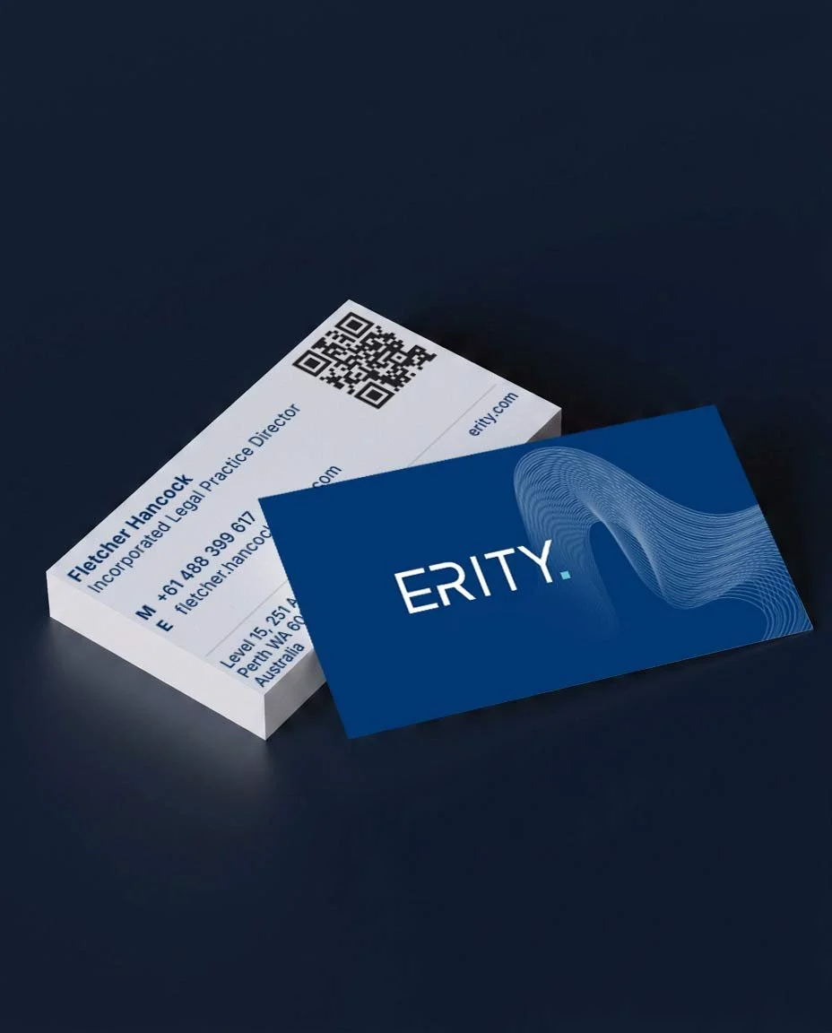
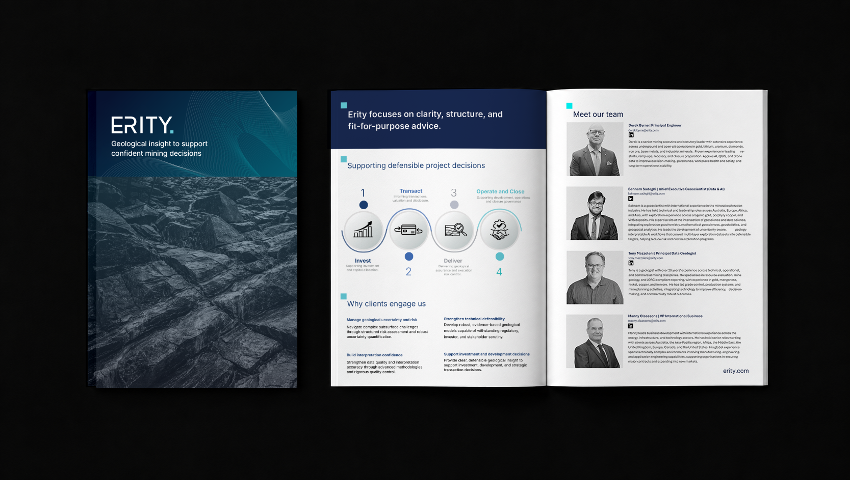
Business cards, capability statements, signs and flyers for expos were also created, with care taken over sizing and hierarchy so the viewer’s eye was guided from the brand to the information they needed first.
Capability Statement
Business Cards